Branding / Identity / Strategy
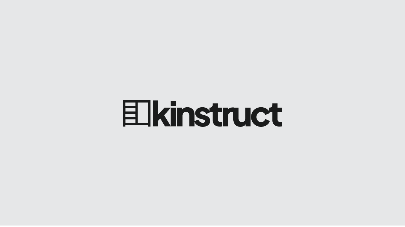
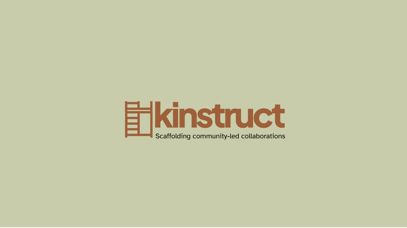
Our commitment to prototyping and building for alternative systems starts with Kinstruct. Built in-house from concept to launch, Kinstruct is a platform for collective project-making: a space where communities can co-design what comes next.
The identity system reflects the platform’s values — participatory, and open-ended.
Context & Challenge
“What kind of tools do we need if we’re serious about designing for more community-centered systems?
We weren’t interested in building another platform(?) that simply connects users or optimizes engagement. We wanted to create something that could help people practice co-ownership, co-creation, and co-responsibility — not just as ideals, but as everyday actions.
Approach & Process
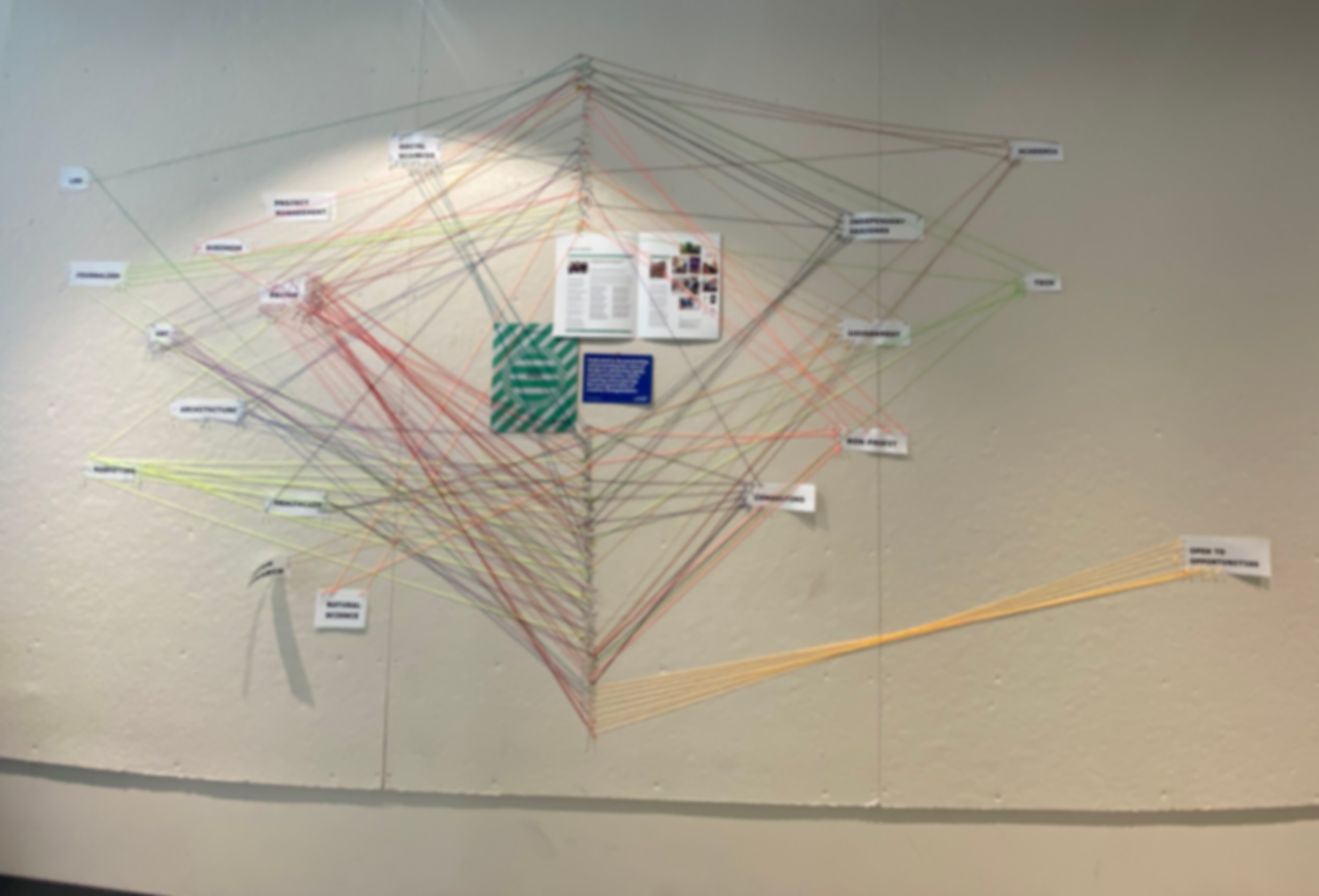
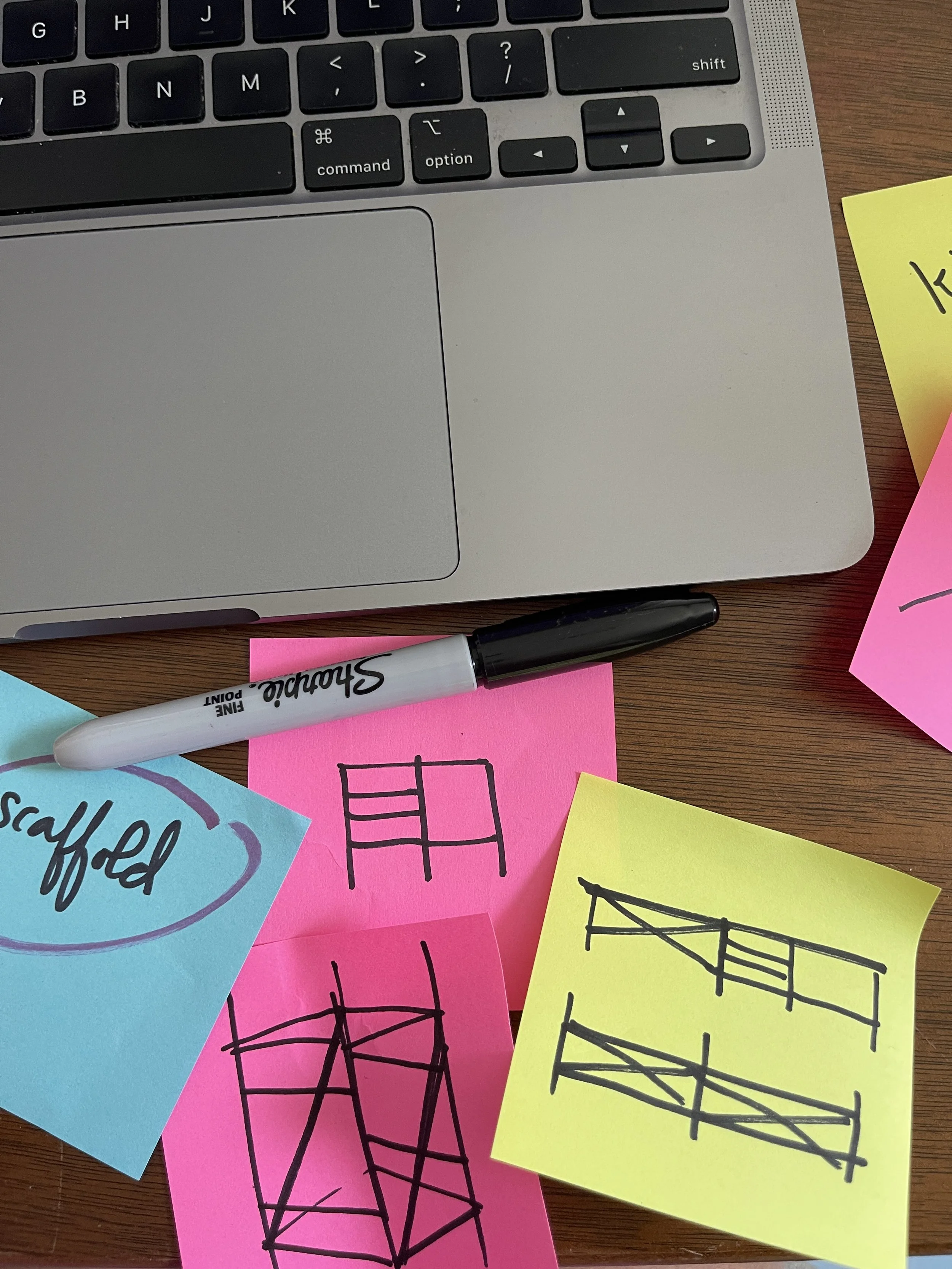
Kinstruct is as much a design question as a product. We approached the identity system as infrastructure: a modular framework that can be adapted, extended, and localized by its users.
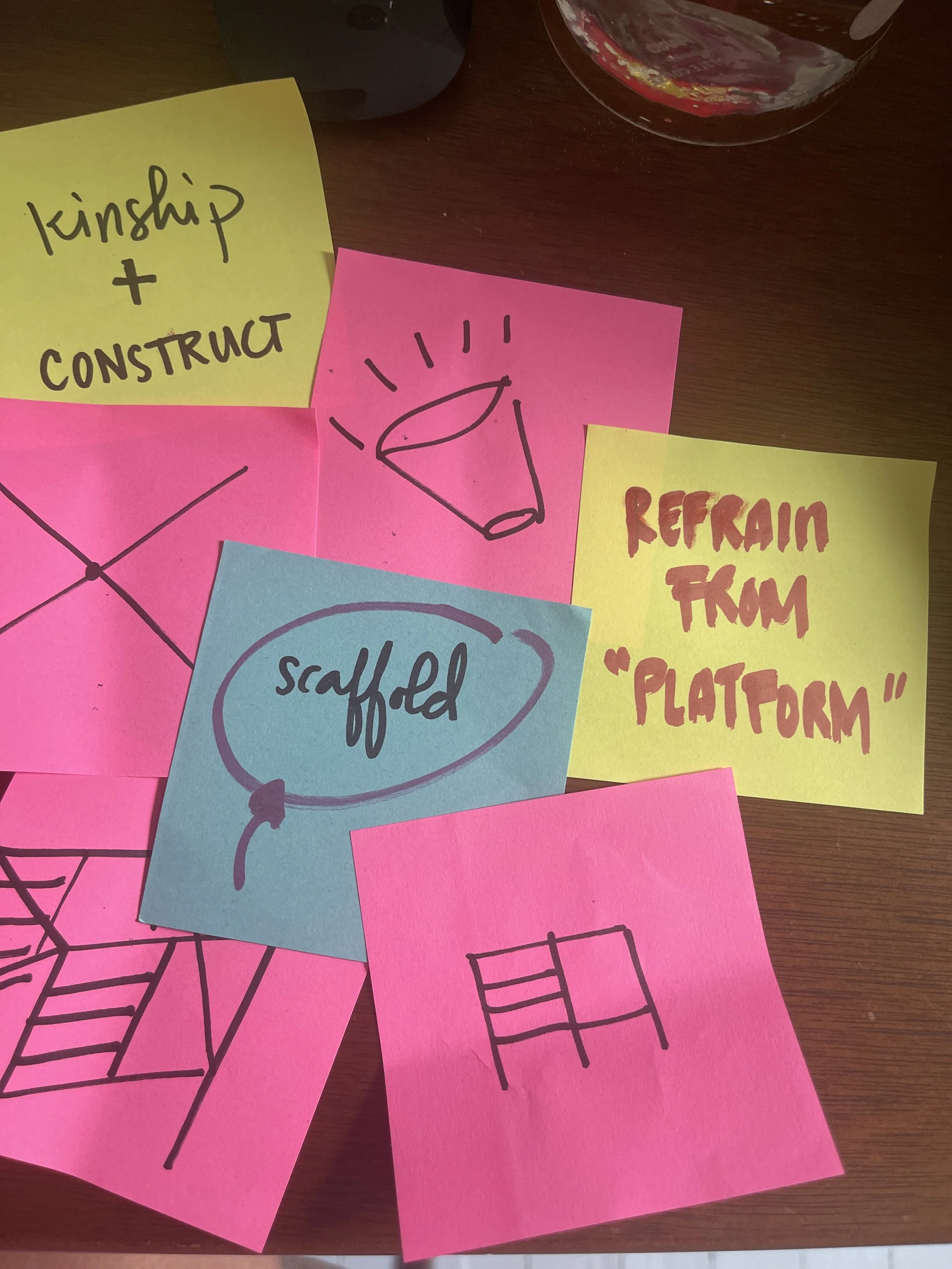
Instead of defaulting to "clean" civic tech tropes, we borrowed from community planning meetings, municipal forms, DIY mutual aid signage, and speculative design tools. We explored naming, narrative, typography, and iconography in parallel — treating each as a way to extend the core values of openness, reciprocity, and care.
Logo:
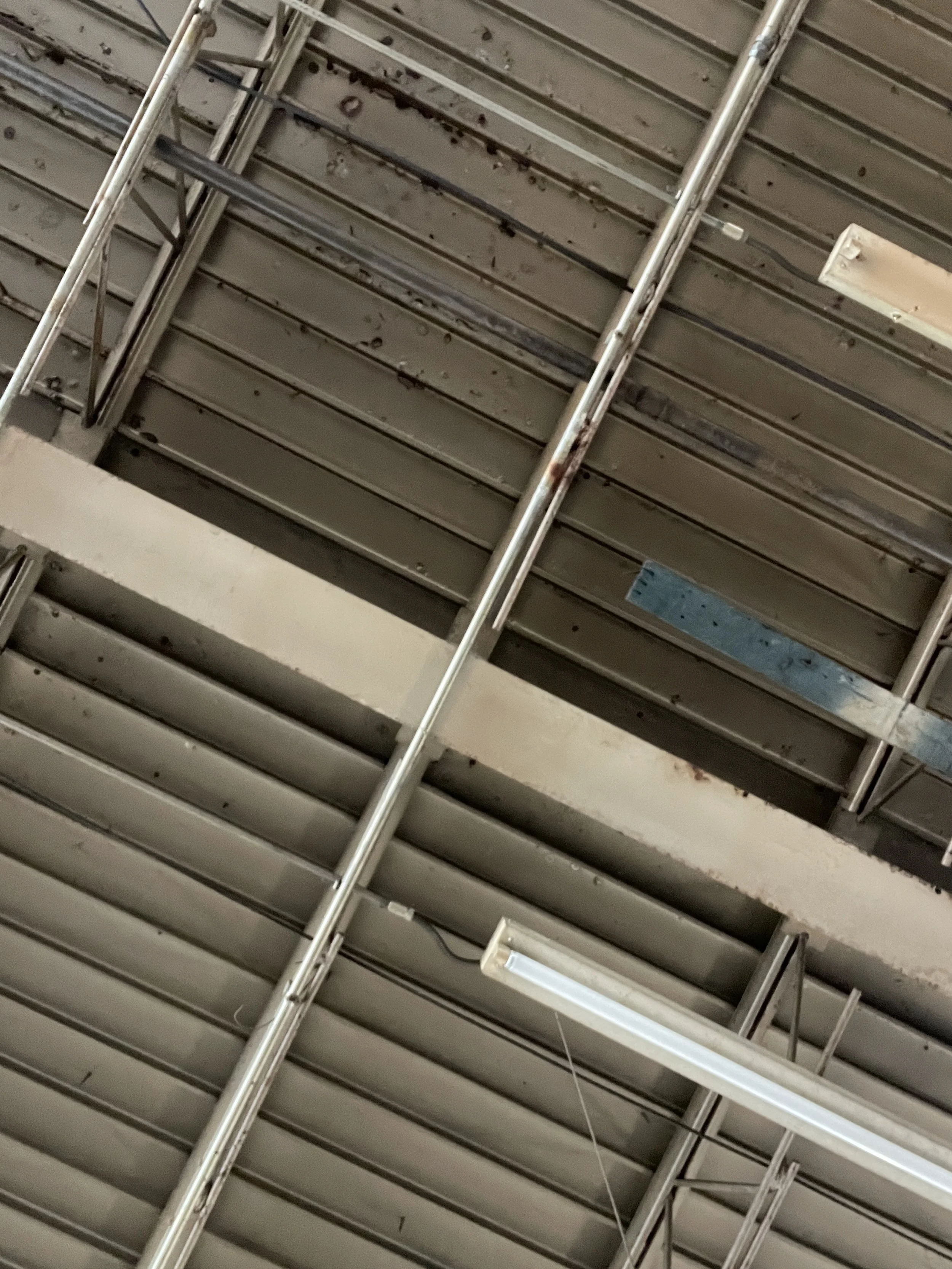
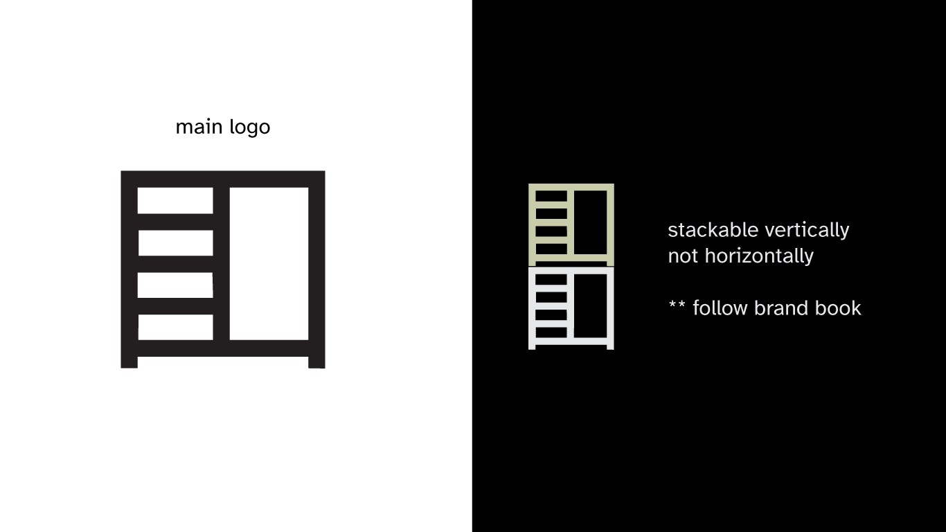
An abstracted side view of scaffolding reflecting, that the work is the community’s. We are more than just a static platform, we are an ever-evolving tool that grows with our users so they can continue to build.
Name:
“Kinstruct” merges kinship and construction
Identity System
Some highlights
Typography:
Our logotype’s foundation is Jakarta Plus, by Gumpita Rahayu of Tokotype. Our app’s main text is Atkinsons Hyperlegible by the Braille Institute. Both choices reflect our commitment to accessibility and supporting work from underrepresented designers.
Color Palette:
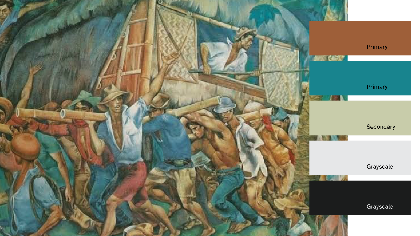
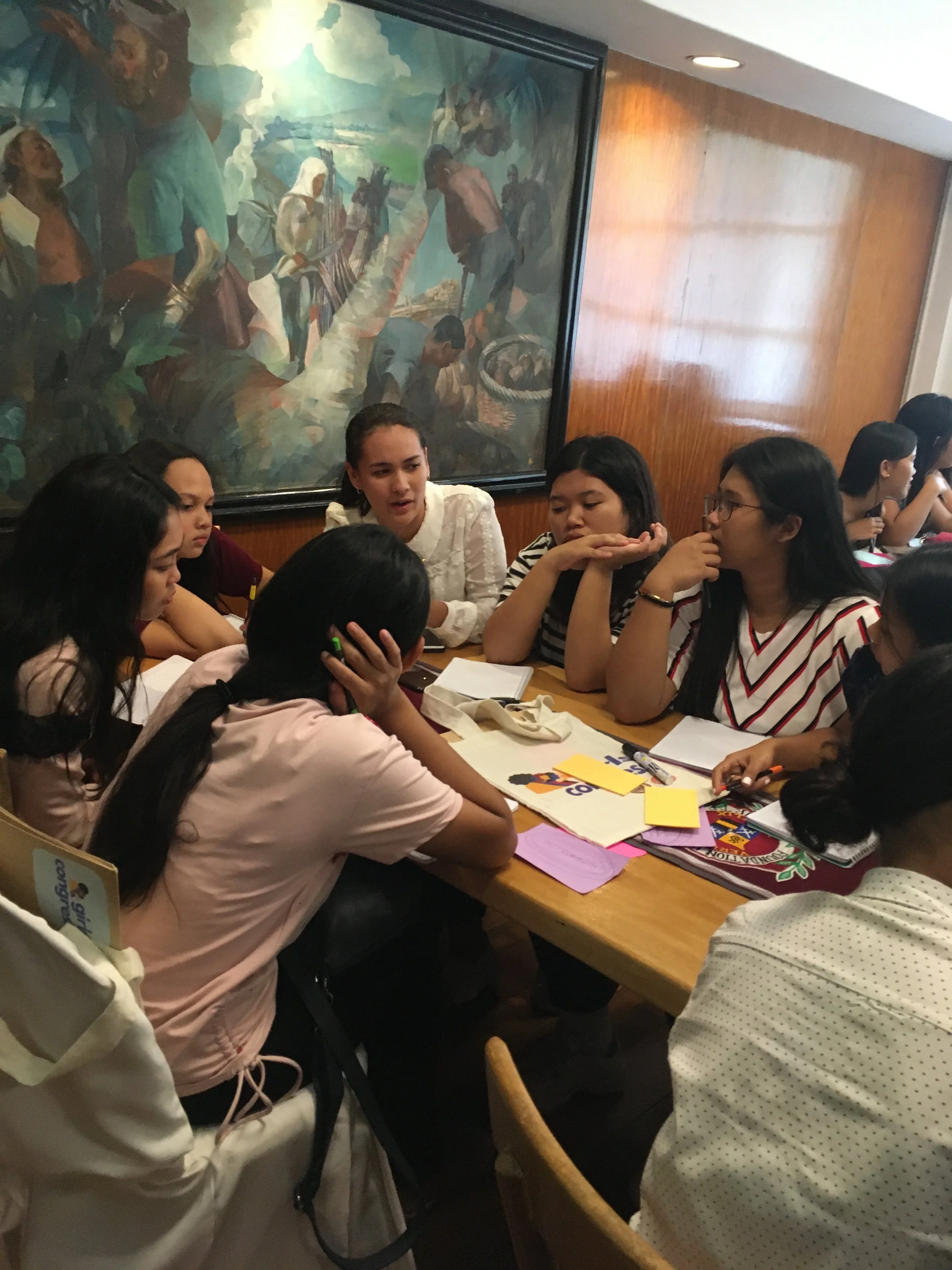
We used earth tones, derived from Carlos “Botong” Francisco’s Bayanihan painting. An art work that represents the values we aim to strive for.
Art Direction for Photography & Graphics
more process,
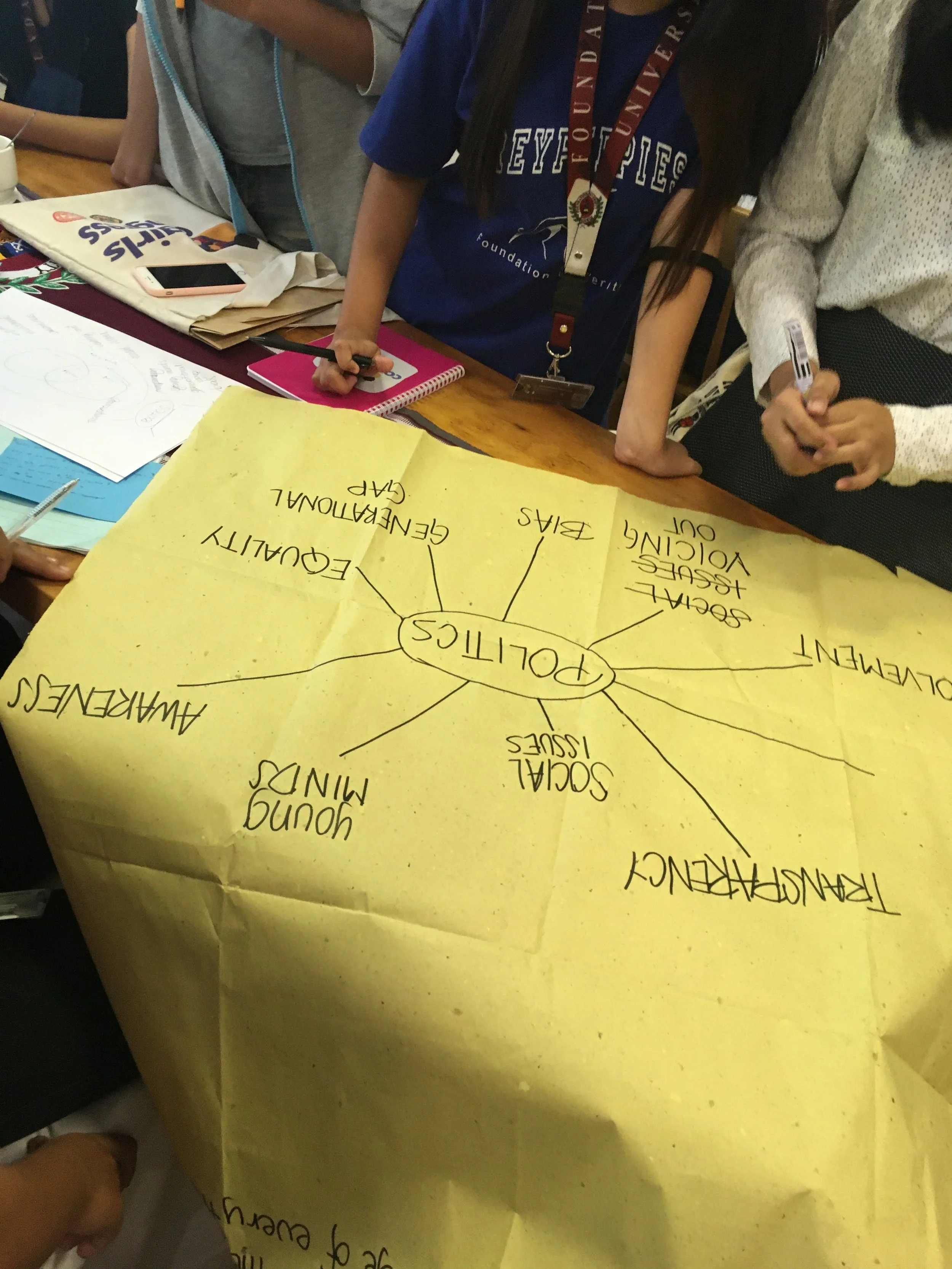
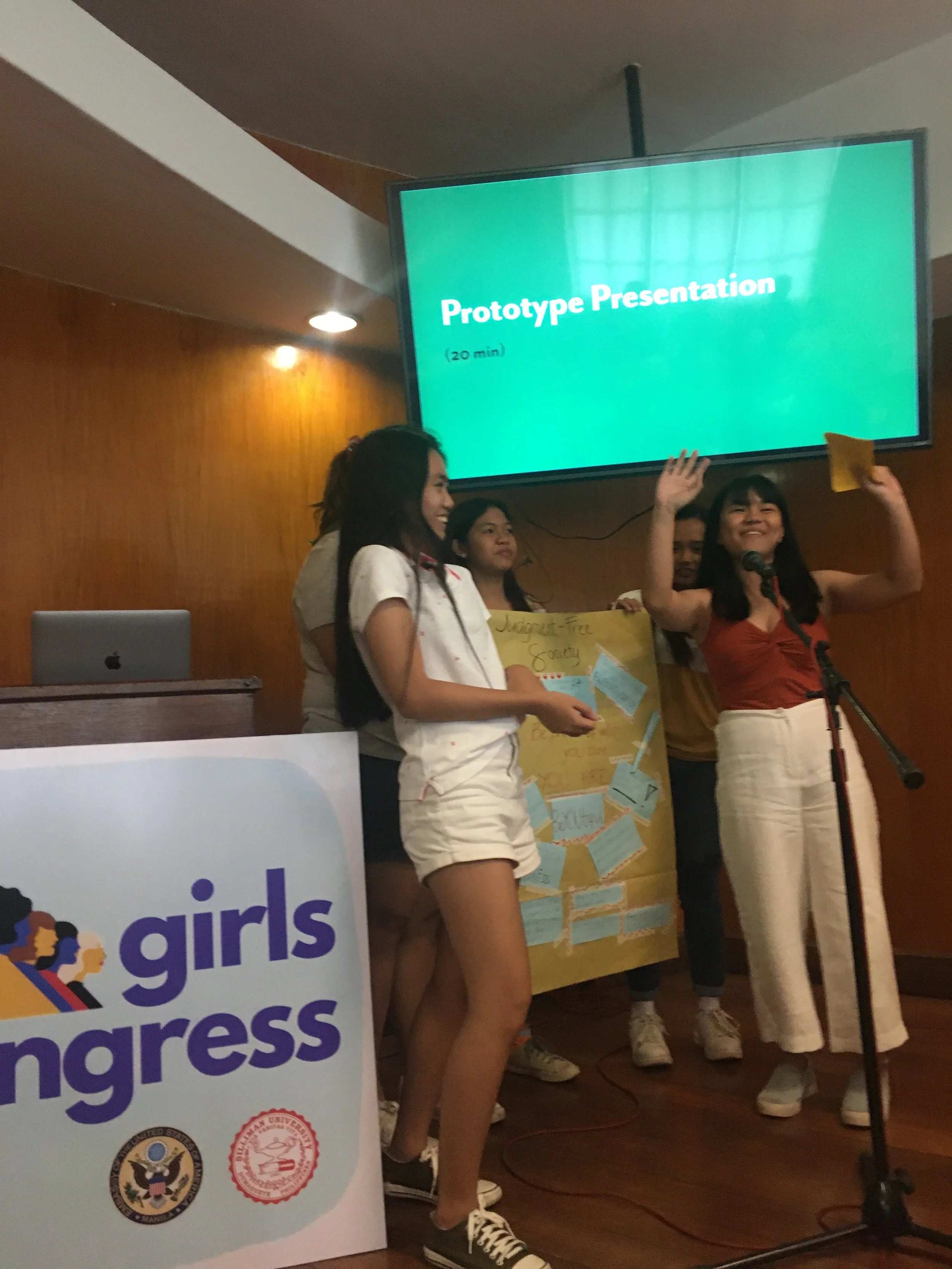
more candid,
more natural.
Kinstruct is scheduled to launch its pilot program this Fall.
Stay tuned for another case study of how we built the digital product